


Intraday Trading: Mastering Candlestick Chart Analysis
How to Read Candlestick Charts for Intraday Trading
Intraday trading is an exhilarating method of investing in stocks, where traders capitalize on the volatility of the market by buying and selling stocks on the same day, without holding any open positions overnight.
This fast-paced trading strategy demands a keen understanding of the market and access to relevant information to make well-informed decisions.
In this article, we delve into the world of intraday trading and focus on an essential tool for traders – the Candlestick Chart. We’ll uncover its composition, learn how to analyze it, and explore various candlestick chart patterns that can aid traders in gauging market sentiment and predicting price movements.
Understanding Candlestick Charts
Candlestick charts are powerful visual tools used by traders to analyze the size of price fluctuations and ascertain the near-term direction of stock prices. These charts are made up of several horizontal bars or candles, each representing a specific time period. The data within each candle includes the opening, high, low, and closing prices for that period.

Each candlestick consists of three crucial parts:

- The Body: This part represents the opening and closing prices during the specified period. The body is colored either green or red, signifying whether the stock price has risen or fallen within the given time frame.
- Upper Shadow: Also known as the “wick,” the upper shadow indicates the highest traded price during the period.
- Lower Shadow: The lower shadow, like the upper shadow, represents the lowest traded price during the given time frame.
Analyzing Candlestick Charts
To extract valuable insights from candlestick charts, traders must grasp the significance of each element. The body of the candlestick showcases the opening and closing prices, which helps traders gauge the price range for the given stock during that particular period. Additionally, the color of the body reveals the price trend; consecutive red candles suggest a falling price, while green candles indicate a rising price trend.
The vertical lines above and below the body, known as wicks or shadows, provide valuable information about the highs and lows of the stock’s traded price. A short upper wick on a red candle indicates that the stock opened near its daily high, while a short upper wick on a green candle suggests that the stock closed near its daily high.

By examining the candlestick graph’s body length, color, and shadow characteristics, traders can infer the market sentiment towards the stock. This detailed knowledge allows them to interpret candlestick charts effectively.
Unraveling Candlestick Chart Patterns
Candlestick charts are not only useful for understanding investor sentiment but also for identifying various patterns that can help traders make informed decisions. Analyzing individual candles is essential, but to spot meaningful patterns, traders need to compare them with their preceding and succeeding candles. Let’s explore two sections of candlestick chart patterns:
Bullish Patterns
- Hammer Pattern: This pattern is characterized by a short body and a long lower wick. Usually observed at the bottom of a downward trend, the hammer indicates a strong buying surge that counteracts selling pressures. If the body is green, it denotes a more potent bull market.
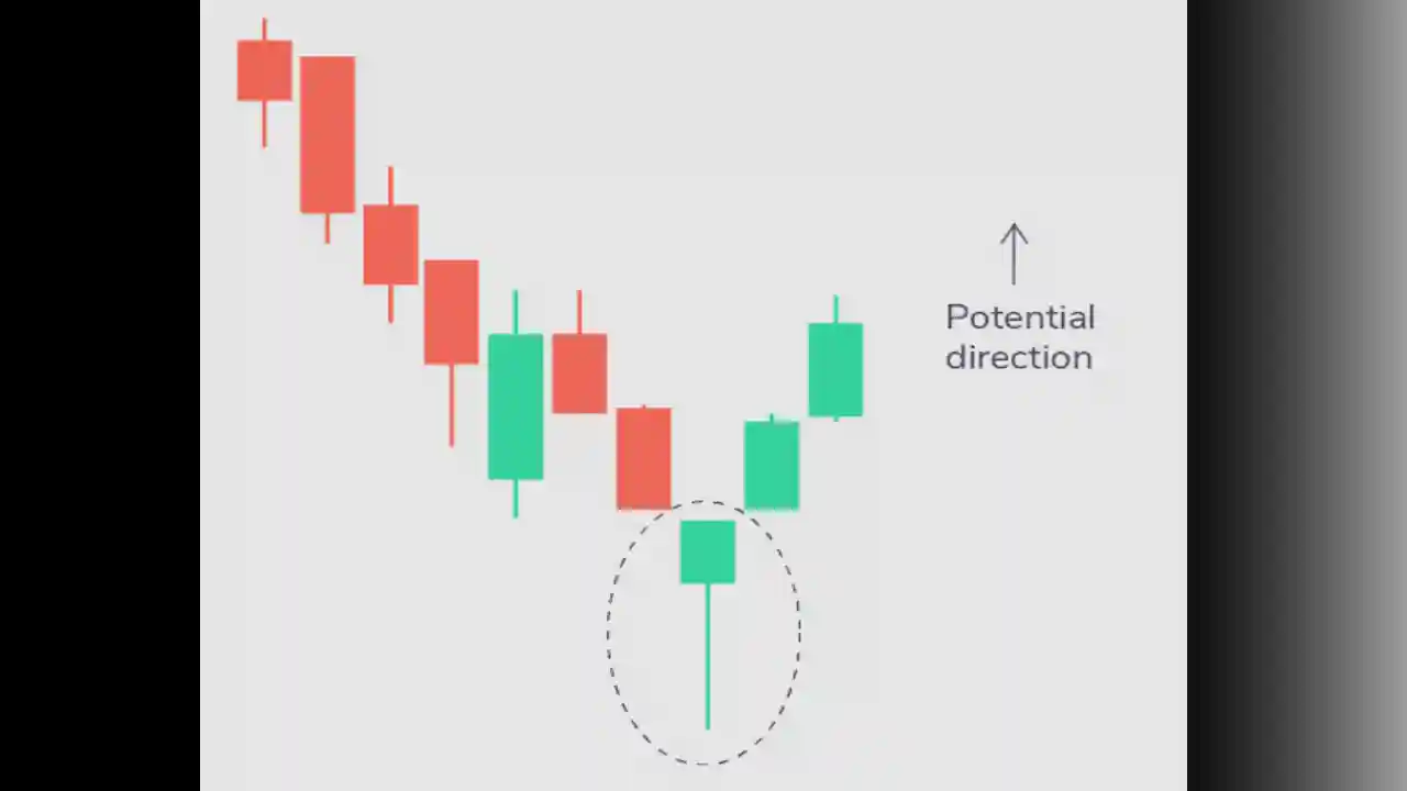

- Inverse Hammer Pattern: Similar to the hammer pattern, this candle has a short body and a long upper wick, typically found at the bottom of a downward trend. It signals buying pressure followed by selling pressure and indicates that buyers are gaining control.
- Bullish Engulfing Pattern: This pattern involves two candlesticks, with the first being a short red candle entirely engulfed by a larger green candle. It signifies a bullish market, pushing the price up despite opening lower than the previous day.
- Piercing Line Pattern: Comprising two candles, the first being a long red candle followed by a long green candle. The closing price of the second candle must be more than halfway up the body of the first candle. This pattern indicates strong buying pressure.

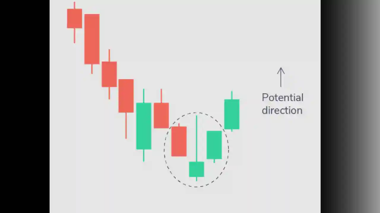
- Morning Star Pattern: Consisting of three candles, this pattern has a short-bodied candle between a long red and a long green candle. Typically, there is no overlap between the short and long candles. This signals a reduction in selling pressure and the start of a bull market.

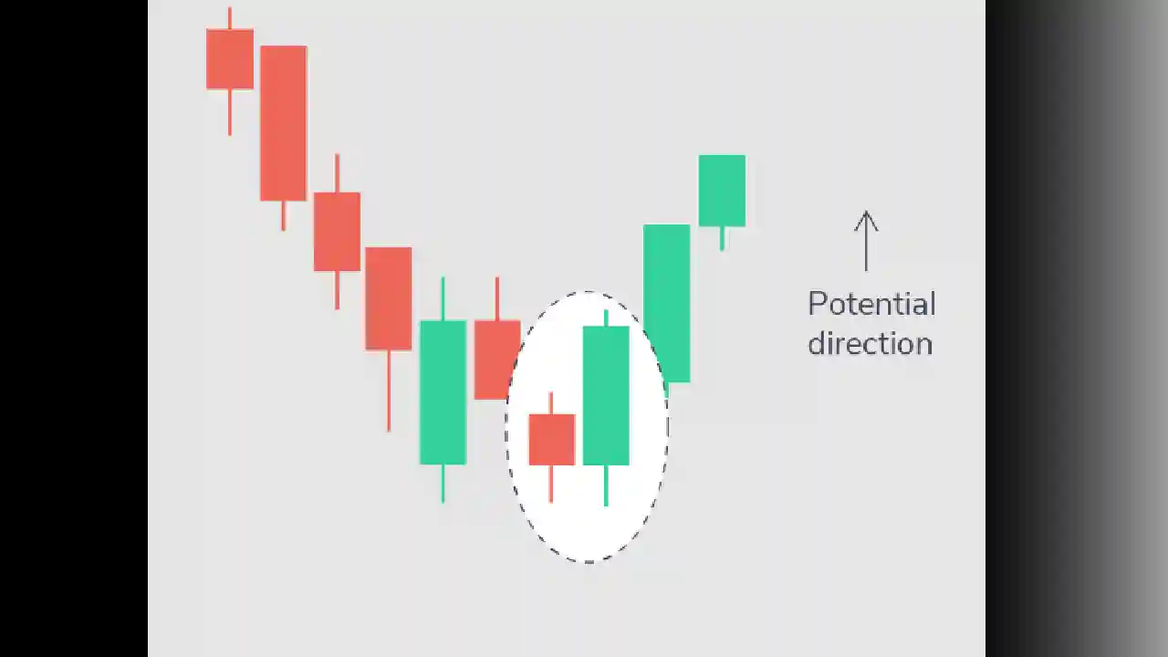
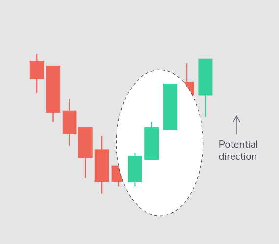
- Three White Soldiers Pattern: This three-candle pattern comprises three green candles with small wicks. These candles open and close higher than the previous day, indicating a strong indication of an upcoming bull trend after a downtrend.
Bearish Patterns
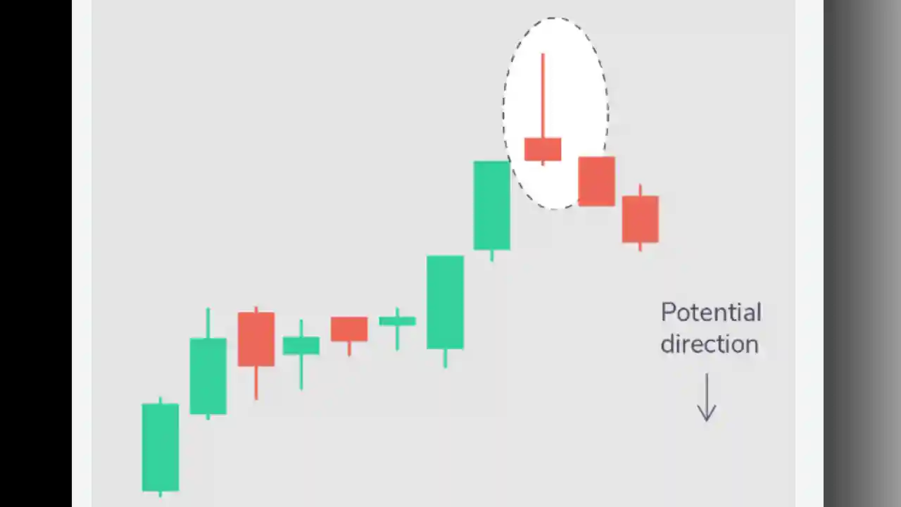
- Hanging Man Pattern: This pattern has a short body and a long lower wick, usually located at the top of an upward trend. It signifies stronger selling pressure than buying thrust and indicates bears gaining control of the market.

- Shooting Star Pattern: Similar to the hanging man pattern, this candle has a short body and a long upper wick, often found at the top of an upward trend. The market typically opens higher than the previous day and rallies slightly before crashing like a shooting star. It indicates selling pressure taking over the market.
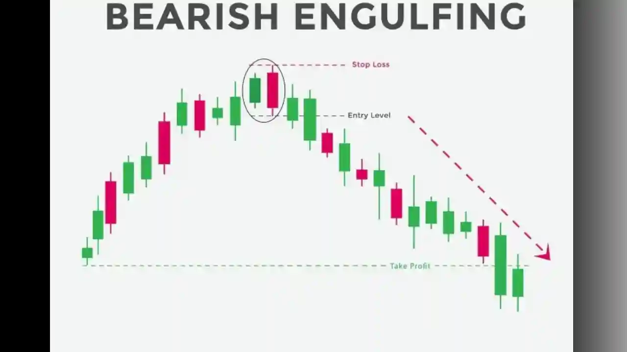
- Bearish Engulfing Pattern: In this pattern, the first candle is a short green one entirely engulfed by a larger red candle. It usually occurs at the top of an upward trend, indicating a slowdown in the market rise and an upcoming downtrend.
- Evening Star Pattern: Comprising three candles, this pattern has a short-bodied candle between a long red and a long green candle. There is typically no overlap between the short and long candles. This signals the reversal of an upward trend, particularly if the third candle overcomes the gains of the first candle.

- Three Black Crows Pattern: This three-candle pattern involves three consecutive red candles with short wicks. These candles open and close lower than the previous day, indicating a strong sign of an upcoming bear market after an upward trend.

Embrace the Power of Candlestick Chart Patterns
Candlestick chart patterns are crucial tools for understanding market trends, investor sentiment, and the dynamics between supply and demand. Mastering the art of reading candlestick charts opens doors to profitable intraday trading strategies. Remember, each pattern provides valuable insights, but the true magic lies in analyzing them collectively.
As you embark on your intraday trading journey, consider this article as a starting point to explore candlestick chart analysis and delve deeper into various patterns to gain a profound understanding of market movements.
Armed with knowledge and practice, you can confidently navigate the intricate world of intraday trading and make well-calculated decisions to seize profitable opportunities.
